Restoring an old Coca Cola sign in Knoxville Tn. Corner of Broadway and Central Street.

By Jim Donahue, Donahue Sign Arts, (865) 577-3365, art.twoedgegraphics.com

Hello, my name is James Donahue, I have been hired to restore the old Cocal Cola wall sign at the corner of Broadway and Central streets, Knoxville Tn. Above is a digital picture I took before I started work. There is actually a lot of information in this picture, if you take the time to look for it. The emphasis in this project is on the historical aspects of the job. That being the case, I am using an older Coca Cola logo. I have seen several, and am using one that is VERY similar to the "cola" word on the old sign. The other part of the logo isn't legible enough to use. The contemporary Coca Cola logo is much more sleek. It's is slender, more italicized, and has better flair on the curves. However, accuracy requires that I use the older one. Not only that, it LOOKS older, and that is very pleasant. Goes well with the 5 cent price. Has the price of the drink gone up, or has the dollar been devalued? Check the price of a 1960 silver dollar. This has to do with fractured banking, but I digress.

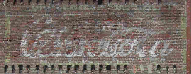
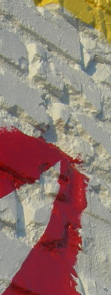
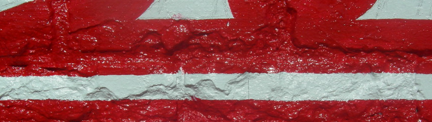
It appears that there have been a number of ads painted on this wall. One of these signs had a wide yellow border. I think that border covered a previous ad. The border paint covered and therefore preserved some lettering under it. The uncovered part of the words would have faded away first, then the border, finally, a hint of the first lettering remains. Look at the top of the sign, just below the holes in the brick wall. To the left is the word "GROCERIES". In order to see it, I tried a bunch of different color and contrast editing alterations, none of which worked. Finally, as I was pushing my chair away from the monitor, I was able to read it. This is important information. I cannot quite make out the word(s) to the right of groceries. My best guess is (small "and" in middle) "FRESH MEATS". Could also be "DRY GOODS".

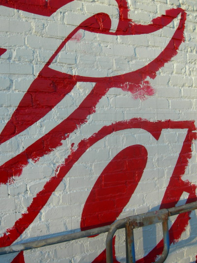
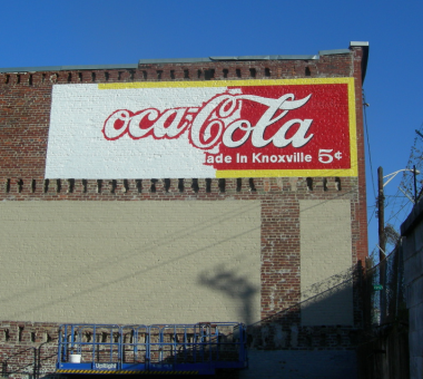
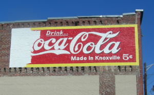
Looking at the bottom of the sign, right where the bottom line of holes is, you can make out some more lettering. This copy is upper and lower case. It's pretty easy to make out "Knoxville" to the right. The left is less clear. Looks a lot like "Made In". Which makes sense if this was a grocery store. Other old Coca cola signs you see say "relieves fatigue" and/or something about sold at fountains. A grocery store would probably have bottles? The holes apparently were for an addition next door, the roof joists would sit in these holes. They are going to stay, so the ad must be a little shorter than before. It's possible that the made in Knoxville was for a different product, which was sold at the grocery store. But it's also very likely that it WAS Coca Cola.

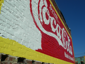
So. based on the evidence, and my space constraints, I chose "Drink Coca-Cola Made In Knoxville 5c" I wanted it to mention Knoxville, because this is our sign, our town, and the place we have to live and work.

James Donahue.

This wall sure isn't as smooth as the first time around. 100 plus years will do that. To the right you can see one of the first steps, cutting red around the white letter. I did it this way for better coverage. A solid white base really makes evrything pop. Most colors will get two coats. All the paints are Sherwin Williams products. Other sign people rated them highly. A few of the brick and mortor surfaces were deteriorating, so if the sign fails, it's probably not the fault of the paint.
Home Page
email Jim Donahue
Window painting on KFC restaurants
Progressing along, weather has been super. Thank You Lord.
To the right is a view from the scissor lift, looking down. The arrows shows where the ground is. This is a nice piece of equipment, nice design anyway. Condition is a bit rough. When it's way up there, it sways. Not really a problem, till I come down on solid ground. Then I feel as though I'm swaying in a boat. Had to hold onto a wall the other day, to steady myself.
Here's my high rise office, complete with thermos of coffee. The square white thing is a water container on the ground, about 4 feet by 4 feet.
Close up view of the work at hand. I've been lettering signs for 26 years, but this job made me learn new moves. This line is below the word "Drink". I filled in the gaps with a smaller brush after this picture was taken.